Manufacture Nevada
Logo design, visual identity, speculative explorations Manufacture Nevada is an invaluable resource that connects businesses with manufacturing experts and resources. As part of a comprehensive rebranding effort, the organization was in need of a new logo and identity that would better reflect its mission and values.
To help Manufacture Nevada achieve its rebranding goals, we collaborated closely to create five unique and distinctive logo options that represented the essence of the organization. We then took our exploration a step further by creating speculative visual identities to see how the logos would work in various real-world applications.
Our approach allowed us to develop a comprehensive understanding of how the logos would interact with other visual elements, including typography, color schemes, and graphic design. This enabled us to create a cohesive and consistent brand identity that resonated with the target audience.
Overall, our collaborative efforts with Manufacture Nevada resulted in a fresh and modern brand identity that effectively communicates the organization's mission and values. The new logo and visual identity represent a bold and innovative step forward for Manufacture Nevada, reflecting the organization's commitment to excellence and growth in the manufacturing industry.
To create a new brand identity and logo, we began by identifying a brand archetype and creating a moodboard to visually represent the brand's essence. This provided a North Star for the team and ensured all design elements aligned with the brand's values.
The result was a bold and gritty visual identity that effectively communicated the brand's personality and values.
Option OneThe focus with this option is on the foundational building blocks Manufacture Nevada provides. The two squares that make up the logomark represent a partnership with businesses. I wanted it to look like they are conferring with each other, and imply the bridging of industry and state. The connection between the two squares is how Manufacture Nevada connects businesses to a network of experts. I also like the unusual lockup of this logo, and had fun creating the visual identity pieces.
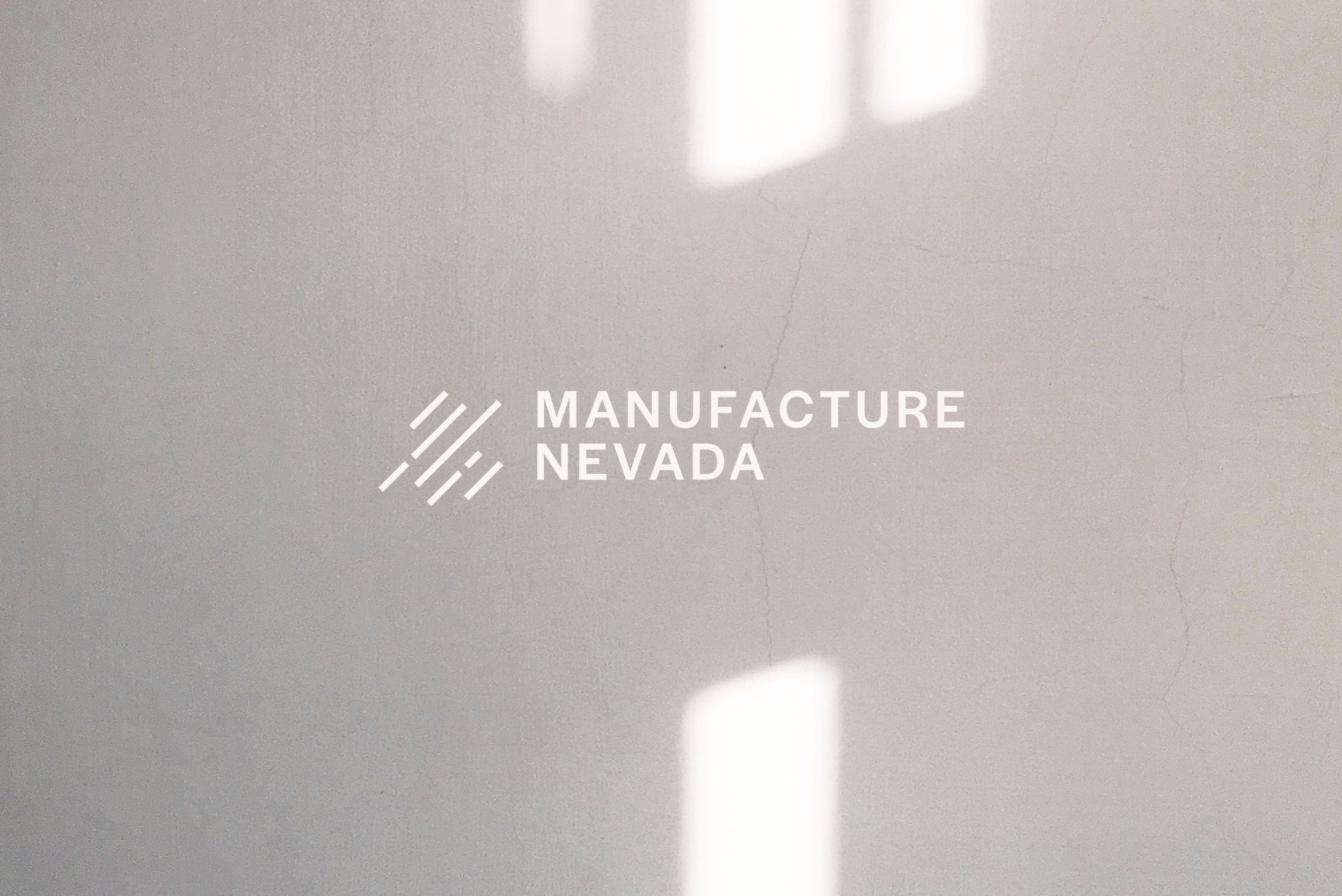
business card Mockup & Viusal identityOption twoInspired by the running bond pattern of brick laying, the angled lines in option two represent a clear path ahead, and capture a feeling of momentum. The line breaks imply a connection and a continued path forward. The logotype is referencing the minimal style of road signs, an aesthetic the client chose during brand identity explorations.
poster Mockup & Viusal identityOption ThreeWith this option I wanted to focus on the industrial aesthetic the client had chosen in earlier explorations of the new brand. I created a logo that is contained—like a stamp—with a set of angled lines representing Manufacture Nevada, Industry and State. The points on the lines also create a nice future forward motion with arrows pointing up. I love how this one works from the positive/negative forms, and becomes like a badge. It was also fun exploring the visual identity pieces by juxtaposing the angles in the logo with soft circles.
letterhead Mockup & Viusal identityAll Three Logo Options for Manufacture Nevada

Option One

Option Two

Option Three


